


#18 Power BI UPDATE - march 2026 - What’s New
BLOGUPDATE OVERVIEWPOWER BI
Sebastian Jagniątkowski
12/10/2025
Welcome to my first English‑language post here on the blog! 😊
At first glance, you might be surprised why this is already post #18 – that’s because all the previous entries were originally written in Polish. From now on, I’ll be publishing both Polish and English versions of my Power BI / Fabric updates and deep dives, so more people can join the ride. In my free time, I’ll also try to translate some of the older posts into English.
Happy reading, and I hope you’ll find this mix of practical tips, clear explanations, and a bit of humor useful in your everyday Power BI and data analytics work! 📊✨
March 2026 is one of those updates that’s really worth pausing for: we got a major upgrade for DAX UDFs, a substantial batch of modeling improvements, TMDL View in preview is landing in Power BI Service, and Translytical Task Flows along with Direct Lake in OneLake reach general availability. Yes, Copilot got its moment too (as every month), but we’ll treat it more as a “turbo booster” that enhances the entire Power BI ecosystem, so it’s good to stay on top of it.
Here are the highlights you’ll find in my summary:
📊 Translytical Task Flows GA – reports that create data
📐 Custom Totals (Preview) – matrix totals that (finally?) add up
🆕 UDFs in DAX get another big upgrade
🧱 TMDL View straight from the browser
🌊 Direct Lake in OneLake enters GA
🤖 Copilot – UX upgrade, not a revolution
🎨 Modern Visual defaults (Preview) – visual polish
📌 Plus plenty of smaller updates, like:
Series label leader lines – clearer line charts
AI Narrative auto refresh
Input slicer with conditional formatting
Deprecation of the old file picker in Power BI Desktop
Deprecation of the QuickBooks Online connector
Let's dive in! 🧐
📊 Translytical Task Flows GA – reports that create data
Translytical Task Flows are now officially GA (Generally Available), and this is the moment when Power BI clearly steps into the world of business applications, not just “dashboards for looking at charts.” In doing so, it also catches up with competitors that addressed this problem a bit earlier
You’ve probably already had users ask whether they could enter or edit data directly from a report interface. Yes, this has been possible before, most often with Power Apps and Power Automate, but in practice those solutions came with plenty of limitations, so they were usually reserved for simpler scenarios. Translytical Task Flows are a different league altogether – and, in a way, a small revolution inside the Power BI ecosystem.
What does it allow?
Users can edit data directly in a report (discounts, status, comments).
Add new entries, such as notes, annotations on records, or even entirely new rows,
Trigger actions in external systems (Power Automate workflows, API calls, even Azure OpenAI).
Thanks to TTF, users no longer need to wait for a report refresh just to make a small change in a table. There’s also no need to rely on external tools or edit data directly in the source system, because everything can happen right from within the Power BI report. Whether it’s updating a status, changing a discount, or kicking off an approval process, one click in the report is enough – without leaving Power BI.
Technically, the whole thing is built on Fabric User Data Functions, and data write-back is supported by Fabric SQL DB, Fabric Warehouse, and Lakehouse, depending on whether your priority is fast frequent reads, simple bulk loading, or minimizing write load on the system.
Is it worth paying attention to? Definitely yes. This is another step toward building reports as applications, not just static data views. If people in your organization still copy numbers from Power BI into email and then back into another system, this is a good moment to rethink the process.
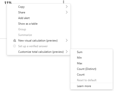
📐 Custom Totals (Preview) – matrix totals that (finally?) add up
If you’ve ever tried to explain to someone why the total row in a matrix isn’t just “the sum of the visible rows” (and watched the slow, quiet despair spreading across their eyes), then… I have good news! Custom Totals lets you override the behavior of totals in a table or matrix at the visual level, without having to hack around your DAX measure.
It looks like Microsoft has listened to one of the loudest advocates of this change, Greg Deckler – though not entirely, because they did not globally “fix” how totals work. Instead, they added a new feature for those who want a different behavior.
How to set up Custom Totals:
Right‑click on a column in your table/matrix,
Select “Customize total calculation”,
Choose whether the total should be Sum, Min, Max, Count, or Count (Distinct),
If needed, you can revert to the default behavior via “Reset to default”.

Below you can see a simple illustration of how this worked before (for a “Number of Customers” example), where the Total row often produced results inconsistent with the visible rows, confusing users, and how it may behave after enabling Custom Totals:
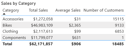
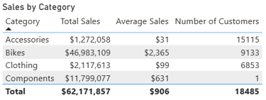
Before:
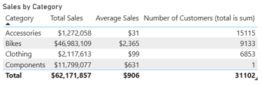
After:
What’s important to note is that this change only affects that specific table or matrix – every visual needs to be configured individually.
Also, although the default behavior may look “nonsensical” at first glance, from a DAX perspective it’s perfectly correct. Microsoft has long been saying that this is not a bug, but a feature of the DAX engine – totals are computed in the measure’s global context, not as a simple sum of what’s visible in the visual. That’s also probably why, despite many complaints from confused users, Microsoft took so long before adding a way to tweak this behavior.
In general, I recommend turning on this feature and testing it in places where the end user expects simple Excel‑style sums – it’s often a much faster fix than rewriting your DAX logic.
However, I’d approach it with caution in more complex matrices (especially financial ones), to avoid totals that look nice but are wrong from a business‑logic perspective.
Whether you stay with the default behavior or use Custom Totals, always check the result in the specific context and make sure it matches what the business actually expects.
🆕 UDFs in DAX get another big upgrade
DAX UDFs are still in Preview, but March brings some very concrete improvements. Here are the key points, with a short explanation for each:
Say hello to the DAX‑level INFO.USERDEFINEDFUNCTIONS(), a new function from the INFO family that lets you pull information about all UDFs in the model (name, parameters, and more). This makes managing and documenting your UDFs much easier.
Better dependency tracking – when you rename tables, columns, or measures, Power BI will try to keep your UDFs in line just like classic DAX expressions, so you need fewer manual code fixes everywhere.
New parameter types in UDFs: CalendarRef, ColumnRef, MeasureRef, TableRef. These introduce much more precise definitions than the old AnyVal/Scalar/Table/AnyRef and help you write more explicit functions. Remember: if a function expects a ColumnRef, you can’t just pass something “similar” and hope DAX will handle it for you – you must pass exactly that type of reference.
Quick queries in the DAX Query View now support “Define with references and evaluate”, so they can detect and trace references inside UDFs.
You can now edit UDFs directly from the Model Explorer, with the formula bar enabled, which makes tweaking them a lot more comfortable.
In the TMDL View you get syntax highlighting that works similarly to normal DAX measures, so code becomes easier to read and to debug.
You can document your UDFs and their parameters using /// comments, which makes in‑model code documentation a lot more natural.
The parameter limit increases from 12 to 256 (so yes, you can theoretically write a monstrous “do‑everything” function… though I don’t recommend it 😄).
Through UDFs, the DAX language increasingly behaves like a “normal” programming language: modular, with clearer types, and with proper documentation options. On one side we have Copilot, AI agents, automations, and the low‑code wave; on the other, Microsoft is still investing heavily in tools that require real analytical and modelling skills – so there’s still hope for us developers🤠.
From my side, I strongly recommend getting to know UDFs, especially when you’re dealing with repeating patterns or similar models across projects. That’s exactly where you can start building shared UDF libraries for your team.
There’s only one “but”: if you’re just starting with UDFs, I suggest diving into them on new projects or isolated models, so you don’t accidentally create chaos in mission‑critical, production‑ready solutions. And, of course, keep in mind that UDFs are still in Preview.
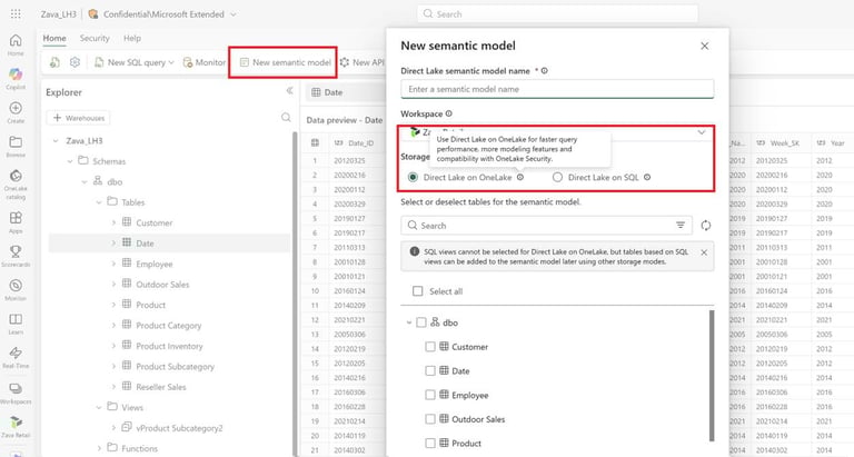
🧱 TMDL View straight from the browser
TMDL View, which we already know well from Power BI Desktop, now appears in web modeling in Power BI Online – still as a Preview feature. Why is this important? It means we gain full access to modeling and code work directly in the browser, without having to download PBIX files at all. Microsoft is increasingly pushing to make browser‑based Power BI feel just like working in the Desktop, and this is another step in that direction.
For people who actively use Git or whose work happens more in the model than in the report layout, this will probably look familiar and not be a huge surprise. But for those who are just starting out, let me briefly explain the main advantages of TMDL View:
you can view and edit semantic models in code, written in TMDL (Tabular Model Definition Language),
you can perform bulk changes, such as mass‑renaming, updating formats, or managing perspectives,
you can treat TMDL as a base artifact in CI/CD processes – scripts, diff tools, and code reviews work much more naturally with this text‑based representation.
Seeing TMDL View appear in the online version really pushes me more toward using web modeling in Power BI. We now get very easy access to model code without having to download files or hook up external tools, which makes it much faster and simpler to fix a measure description, set the isHidden flag on objects, or make other small but frequent model‑level tweaks right from the browser.
🌊 Direct Lake in OneLake enters GA
Microsoft highlights that this is one of the key highlights of this update. The idea is simple: your data sits in OneLake in open formats (Delta Lake, Parquet), and the semantic model in Power BI runs in Direct Lake mode. In practice, that means instead of painfully waiting for classic Import‑mode refreshes, you can fetch data live from the data lake, while still keeping full modeling and DAX capabilities – without the usual compromises of DirectQuery.
Microsoft clearly suggests:
Direct Lake on OneLake – when you want to follow the Fabric platform’s direction and leverage native OneLake security, full modeling support, and higher performance.
Direct Lake on SQL – when you need to stick to SQL‑endpoint security rules or keep a fallback to regular DirectQuery.
If your organization has access to Fabric and teams are complaining about long refresh times for large models, March 2026 is a good moment to test Direct Lake on one specific scenario and compare the refresh time, report behavior, and overall comfort of working with the model.

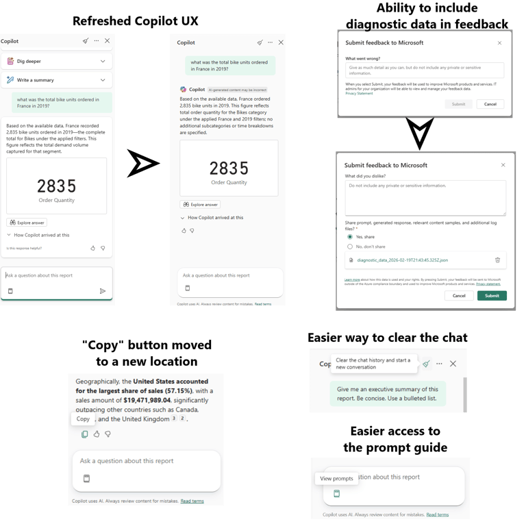
🤖 Copilot – UX upgrade, not a revolution
In this update, Copilot mainly gets a UX refresh, not any ground‑breaking new features. The most important things you should know:
we gain a new look for the Copilot panel in reports and apps, now more consistent with the Standalone Copilot experience,
the Copy button has been moved to a more logical place at the bottom of Copilot’s responses,
the input field stays active even while the response is being processed – you can type the next prompt, but it will only be sent after the previous one finishes,
the “suggested prompts” buttons disappear once the conversation starts, but you can bring them back via the prompt guide (the book icon) or by clearing the chat,
there’s also an updated feedback dialog: when you send feedback, you can attach diagnostic data, see a preview, and decide for yourself whether you want to send it.
Of course, Copilot is looking better and becoming more pervasive, but it’s still not available to everyone. You need the right licenses/capacity and admin‑side configuration, so for many users it’s still more of a nice‑to‑have curiosity than a core part of their daily workflow.
🎨 Modern Visual defaults (Preview) – visual polish
Microsoft introduces „Modern visual defaults and customizing theme improvements”, which means new reports start out with a more modern, cohesive look based on Fluent 2 – the set of UX/UI design principles Microsoft uses in its current visual cycle across apps to keep a consistent interface. For the curious, here’s a link to the Fluent 2 page. 🤓
Back to the update: this is a Preview feature, so you need to enable it in the settings first. What changes when you switch it on?
reports start with a default gray canvas 1080x1920, designed to feel more like a dashboard-ready page from the beginning,
visuals automatically get more sensible default padding and spacing around the edges,
the subtitle option is enabled by default on visuals,
new slicers start as dropdowns, instead of taking up a full list of checkboxes,
buttons and interactive elements get a slightly refreshed visual style.
On top of that, there are theme improvements:
you can now set the default page size directly in the theme JSON (like 1920x1080),
you can define structural colors (e.g. foreground, background, secondaryBackground) and then reference them in visual formatting, instead of copying the same HEX codes in dozens of places.
These may seem like small details, but exactly these kinds of tweaks make it much easier to create a consistent report design and save hours of manual formatting. I recommend turning on this Preview feature and testing it yourself – especially if you’re already working with theme JSON and corporate‑wide design standards.
🆕 Other news
Series label leader lines – clearer line charts
Series label leader lines is a new feature that appears in line charts. It’s especially useful when you have a lot of series on one chart and many of them end around a similar position on the axis. The change introduces short lines connecting each series to its label, which makes the chart much easier to read. Additionally, the layout engine will try to avoid label collisions and overlaps, and you can freely customize how the lines look – thickness, transparency, etc. As a bonus, the interaction in line charts with series labels turned on has been improved: selected lines will now be highlighted more clearly, whether you pick a single line or multiple lines at once.
AI Narrative auto refresh
If you use AI Narrative, you can now turn on Auto refresh, so the narrative updates automatically after you change slicers, without having to click “Refresh” by hand. We’ve just saved one more annoying click from the daily workflow.
Input slicer with conditional formatting
The Input slicer, which has been around since earlier updates (check out my February post for more details), now gets conditional formatting – that little Fx icon for various elements: text, icons, borders, accent bar, and more.If you build more interactive reports (for example, with input parameters used by Translytical Task Flows), this is the perfect combo. With conditional formatting you can:
change the color of the placeholder or the accent bar depending on the status,
highlight the Apply button when some condition is met,
visually signal that an input filter is “important” (for instance, a required ID or range).
Deprecation of the old file picker in Power BI Desktop
Until recently, in Preview settings you could still enable or disable the new file picker. But from April 2026, as part of update SU04, Microsoft is doing a “silent update”: the old UX for selecting file locations will disappear and cannot be brought back. All core functionality – opening, saving, and folder navigation – stays the same, but the layout and look become more modern: quicker access to OneDrive/SharePoint, the ability to pin frequently used folders, and more intuitive paths. Overall, this is a change you can safely mark as a plus.
Deprecation of the QuickBooks Online connector
This is a fairly niche topic, but since the QuickBooks Online connector is being retired in March 2026, with no new connections supported and existing connections possibly breaking, I decided to mention it here.
✅ SUMMARY
In my opinion, March 2026 brings a solid update that will satisfy both front‑end‑focused and back‑end‑oriented users. On one side, we get Translytical Task Flows (GA) and the Input slicer with conditional formatting, which turn a report from a passive view into an active work tool. On the other side, Direct Lake in OneLake (GA) and TMDL View in web modeling (Preview) push Power BI and Fabric further toward code‑style, developer‑style modeling. On top of that, DAX receives important UDF improvements – a key highlight of this update – and reporting gains a set of very practical, down‑to‑earth enhancements: modern visual defaults, custom totals, leader lines, and UX polish. Copilot, meanwhile, stays relatively calm: no revolution there, just refined visuals and UX tweaks.
⭐ TOP 3 things worth checking out right away
Translytical Task Flows (GA)
Look through your existing reports and identify places where users perform manual actions around the report (filling out forms, copy‑pasting to/from Excel). The scenario doesn’t need to be complicated – even a simple write‑back of a comment or status can be a great starting point.
TMDL View (web)
Take a peek at TMDL View in the web experience. Try it at least for a quick test, even if you won’t implement full CI/CD right now. Just understanding how the model looks in TMDL will pay off in a few months, when your organization begins to care about this kind of workflow.
DAX UDF
If your work focuses on modeling and Power BI’s backend, definitely dive into UDFs. Start by taking one repeated DAX pattern and turning it into a UDF – it’s a small step that often leads to a much more maintainable model.
I invite you to explore more posts on the blog! You’ll find earlier update summaries and other interesting articles, all explained in a simple, clear way, without unnecessary technical noise so you can save hours of digging through official documentation.
If you like what I’m doing, check out my profiles on Instagram and LinkedIn, where you’ll find more of my content. 😊
And be sure to browse my other blog posts: [LINK]